The red itself. In couture, an entre-deux is the narrow band of lace sewn between two pieces of fabric to join them, as this red joins two others.
18 October 2026·17 min read
How I Redrew My Portfolio
I've just redesigned my portfolio. It used to be blue. It's red now, and almost everything around that red has changed with it.
We live at a time when almost anything can be made. Code is nearly free, and AI does much of the rest; I wrote about how I work with it in How I Work With Agents Right Now. When everything is within reach, what makes a thing yours is what you choose to make, what you choose to leave out, and why. Intention comes first.
So instead of starting from a style, I started from the things I love, and let each of them leave its mark on the page: a watch, two reds, the letters we've stopped writing, and the light. In How a Tweet Changed My Life, I wrote that every detail counts, even the ones nobody will consciously notice. These are the details of this site, and the stories behind them.
The red
The site has one colour, and I knew early on it would be a red. Of all the reds I know, the two I've loved the longest are Cartier's and Ferrari's, and I couldn't choose between them. So the red here is made from both.
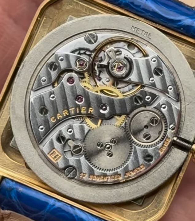
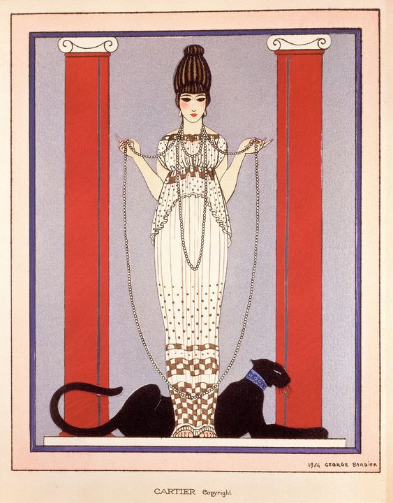
Cartier, to me, is French excellence. Behind the name there is an atelier, and more than a century and a half of people perfecting the same gestures: setting stones, shaping cases, finishing the smallest parts by hand. It's the same idea of craft I try to bring to my own work, with code instead of gold. And of everything that comes out of that atelier, what moves me most is their watches.
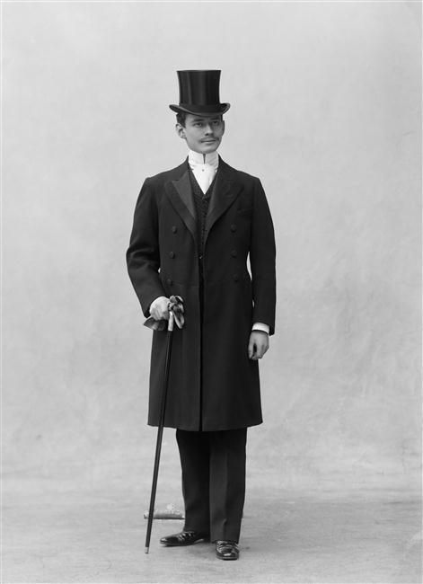
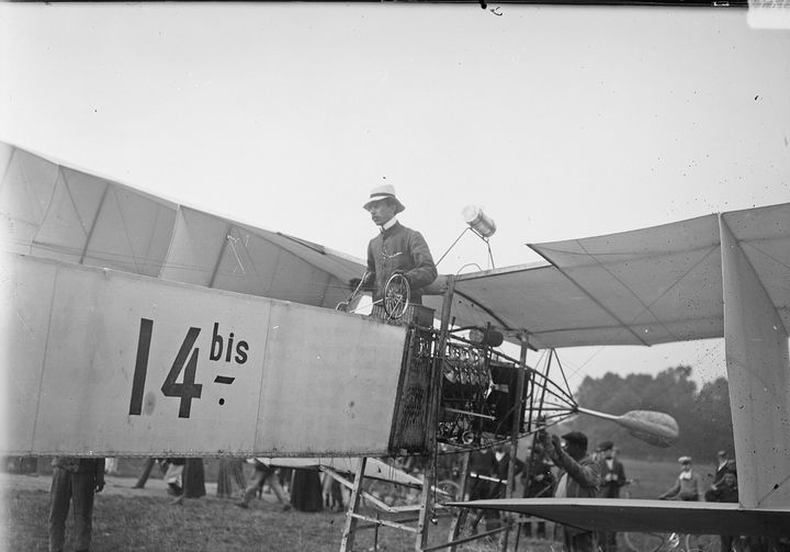
For years, my dream watch was the Santos-Dumont. Its story begins in Paris, in 1904. Alberto Santos-Dumont, a Brazilian aviator and a friend of Louis Cartier, couldn't take out his pocket watch in flight without letting go of the controls. So Cartier designed him a watch to wear on the wrist: a square case with its screws left in view, and Roman numerals on the dial. It became one of the first wristwatches made for a man.
I bought mine when I joined Vercel. It was a huge step in my career, and I wanted to mark that moment with something I would keep. You'll find the watch all over this site: in the numbering of the sections, in the hour at the top of the page, and in the movement that keeps that hour.
Ferrari is the other side of the same colour. Where Cartier is patience and precision, Ferrari is Italy, and passion: the factory in Maranello, the noise, the speed, some of the most beautiful engines and cars ever built. Its red isn't a quiet one. You see it from the other side of a circuit, and you feel it before you understand it.
It came to me through my father. On the weekends I spent at his place, he showed me Formula 1. It was the time of Michael Schumacher, already a legend, and of red cars that seemed to win every Sunday. I was a child. I didn't know yet what I was looking at, only that I couldn't look away. That's how a passion starts: quietly, long before you have a name for it.
Then life took over, and through high school and my studies I stopped watching. A few years ago I came back, following Charles Leclerc, and Lewis Hamilton, from his years at Mercedes to his move to Ferrari, and a lot came back with it. Ferrari is almost a religion: you only have to see the crowds dressed in red, at every race, in every country. And for me it's also the F40, which holds all of it at once: memories, desire, and a longing for the future.
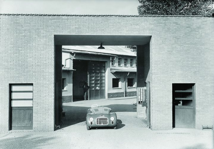
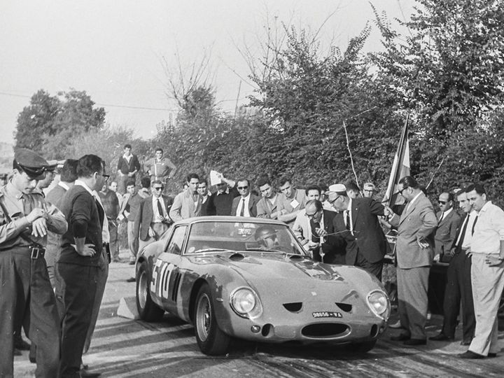
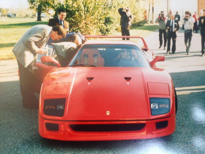
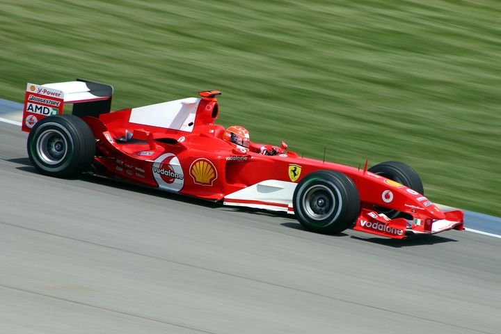
Side by side, the two reds are closer than you'd think: almost the same hue, almost the same strength, with Cartier's just a little darker. So I mixed them in OKLab, a colour space built around the way our eyes see, and took the point exactly halfway between them. Drag the needle, and the page's red follows.
Cartier #C10016Ferrari #DA291C
That point also has the same lightness as my old blue, so nothing on the pages got heavier when the colour changed. At night the red is a touch brighter, so it still reads on black.
- Entre-deux #CD1919
- At night #E1342D
The same red, lifted for dark grounds.
- Envers #901112
L'envers is the back of a fabric, the side you don't see. It's the ground under the page.
- Bone #EBEBEB
Everything drawn on Envers: the lines, the text, the mechanism.
- Ink #171717
The deepest grey, for text on white.
The letter
The site is two things at once: a letter, and a drawing sheet.
I don't write letters, and I think it's a shame we're losing them. Everything is instant now. Messages arrive before we've finished thinking, nobody waits for anything, and text can be generated without end. A letter asks for the opposite. You write it with an intention, you take your time over each line, you send it, and then you wait, sometimes for days, for an answer. It teaches you to care about the way you write, and to be patient. And there is something romantic about it that nothing has replaced: letters run all through history, they've changed the course of things, and they've started passions and love stories we still read today.
So every page here is written like one. It opens the way a letter does, with the place and the date, London and today, beneath the H of my signature. And it closes with the signature itself. A signature is a stamp, like the one at the bottom of a document: it says that I made this, and that I stand behind it. I sign Hugo rather than Hugo Richard, because a surname always keeps a little distance, and a first name is how you sign a letter to someone you know.
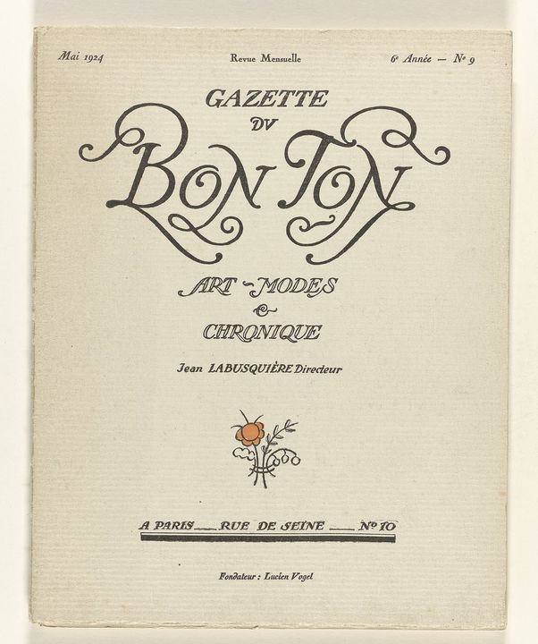
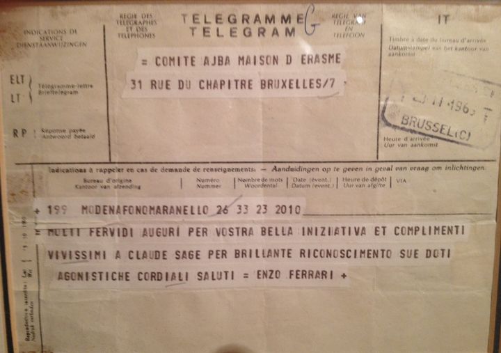
Three typefaces share the page, one for each voice: the titles of the letter, its text, and the measurements of the drawing.
- Redaction
The titles. A serif Jeremy Mickel drew in 2019 from the typefaces of official documents, Times New Roman and New Century Schoolbook, then took somewhere else: soft, round curves that end in terminals as sharp as a blade. Its italic sets the red numerals.
- Geist
The text. Vercel's typeface, drawn in the Swiss tradition: plain, precise, made to be read.
- Geist Mono
The measurements, notes and captions. Every character takes the same width, like figures on a drawing.
When you arrive here, I'd like it to feel like receiving a beautiful letter: a good moment, a few things to take away from what I've written, and the feeling, somewhere, that it was made with care.
The drawing sheet is the other half of the site, the workshop behind the letter. It's where things are designed, measured, and redrawn until they're right, which is how I like to work. Every page sits on the same plate of five columns.
1024
224Index
48
528Measure
48
176Notes
And you can decide how much of the drawing you want to see. In the footer, or with the D key, the page goes from a clean fair copy to the full drawing, with every measurement written in its margins.
The light
A letter is always written somewhere, at a certain hour. So is this page. It's lit by the sun over wherever I happen to be, and the city written at the top is real: I change it when I travel, because a letter has to come from somewhere, and knowing where brings you a little closer to whoever wrote it.
The light comes from photography, and from painting. When I take pictures, it's what matters most, and nearly always what decides whether a picture is worth taking. The same street can be flat at noon and beautiful an hour before sunset, when the light comes in low and catches a face, the leaves of a tree, the texture of a wall. Very often a good photograph is just good light, seen at the right moment.
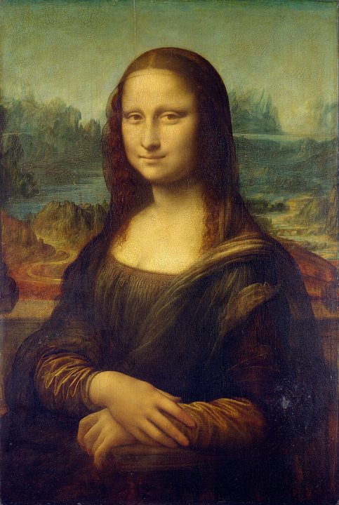
A photographer waits for that light. A painter has to make it, with nothing but pigment, and the painters I love most are the ones who made it best: Leonardo's sfumato, the soft shadow that lets a face dissolve into the air around it; the warm skies of Titian; Caravaggio's beam of light cutting across a dark room; the daylight Vermeer lets in through a window; the sun on Fragonard's pink silk in a shaded garden; Van Gogh's yellow lamp under a night sky. Each of them found their own way to put light on a flat surface.
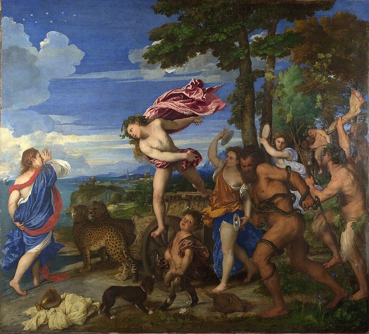
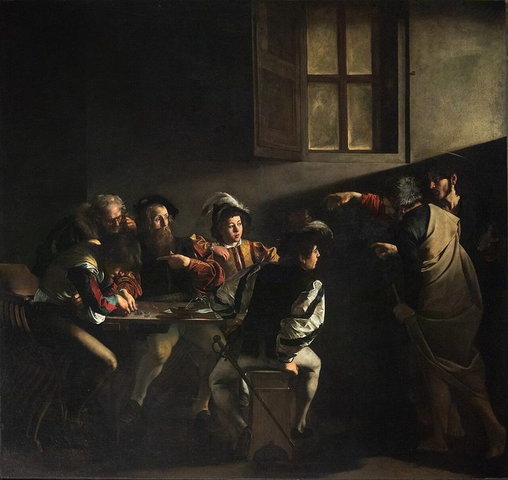
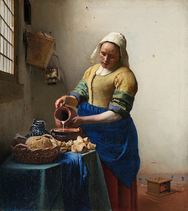
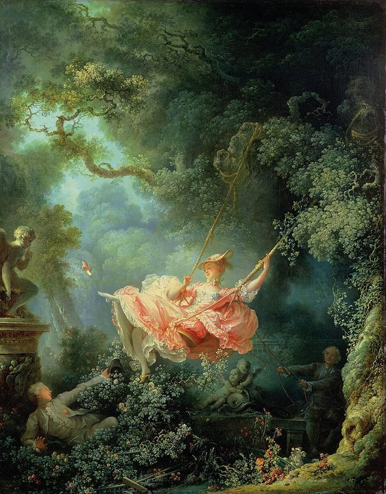
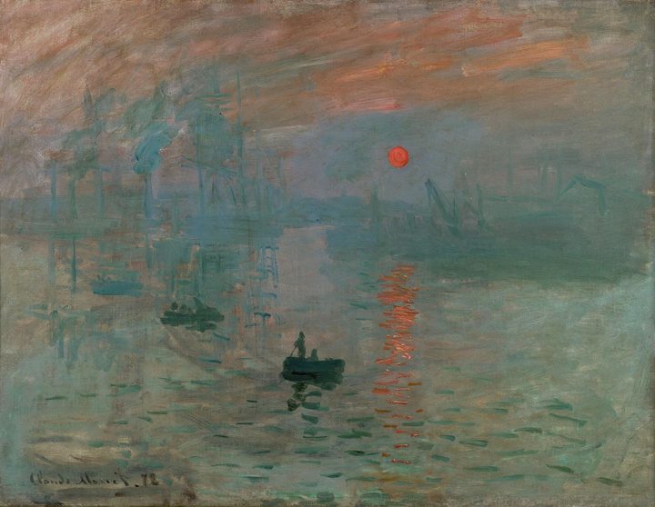
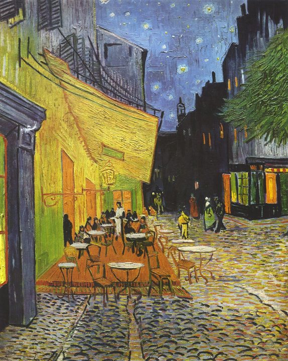
And then Monet, who made the light itself the subject. In Rouen, he painted the front of the cathedral more than thirty times, from across the square, at different hours and in different weather, because the stone was never the same colour twice.
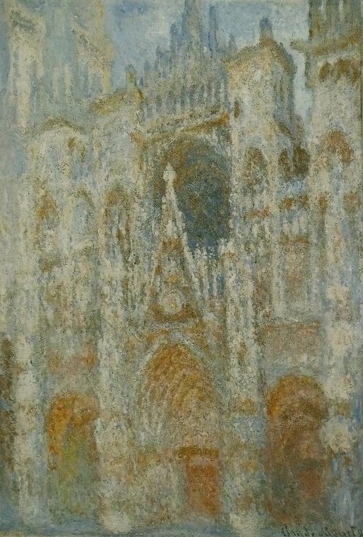
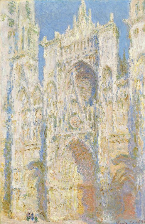
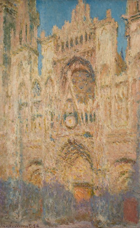
That's what I wanted for this page: a light of its own, one that changes through the day, like the stone in Rouen, or anything I photograph.
There's also a moment in photography I've always loved: before the print, there's the negative, the same picture with light and dark swapped. Lift the corner of the home page, and that's what you'll find under my portrait: its negative, laid on a light box, as if it hadn't been printed yet.
The hour comes from the watch. The page keeps time the way my Santos-Dumont does, with a movement, and its sections are numbered like the hours on its dial. Pull the crown and turn it: the hands move, and the whole page takes on the light of that hour.
Through the afternoon, the white slowly turns to parchment. After sunset the page becomes a violet dusk that darkens until it's black, and before sunrise it goes through the same in blue. None of it ever makes the page harder to read: every grey keeps the contrast it has at noon, and the red slides gently along its band, towards Cartier's as the light falls, towards Ferrari's at dusk.
And if you'd rather choose for yourself, the dot in the footer sets light or dark by hand. Press it again, and the page goes back to following the sun.
Underneath
Lift any corner of the page, and it folds back like a sheet of paper. On a phone, tap the corner and the page turns over, like the page of a book. I like design that makes you feel something, and few gestures are as familiar as lifting a sheet of paper to see what's underneath. It's also the transition the site needed: the letter is on top, the drawing sheet lies underneath, and something has to take you from one to the other. Nothing does that better than lifting the page.
The letterUnderneath
What you find here is the working drawing of the page you were reading, and the mechanism that runs it. Everything that changes on the page by itself sits right above the part that changes it: the movement beneath the hour, a lever for the light, a wheel for the level of detail, a chime for the sound. Point at a part's number, and it tells you what it does. Around them lie the request that brought you here, the file each block of the page comes from, and the last changes made to the site.
Iterate
Iterate to Greatness.
Of every idea I've come across in my work, it's the one I find most powerful. When you chase perfection, you miss the point. It's been said a thousand times, but it's true: perfection isn't something you can reach. And while you wait for it, you sometimes never release anything at all, because it's never quite ready.
Iterating is the opposite. You release something that already holds the foundations of what you think and what you want to show, and then you keep going. You improve it, people tell you what they see, and what they tell you improves it again. There's no end to it, and that's exactly what I love. Most of the time, the process is the most interesting part, and the most fun. For me, it's the only real way to move forward.
It's something I did less with my projects before, and I want to do much more of it now: not drop the things I start, give them time, and keep taking them further, so that the people who use them know someone is behind them.
It meets another phrase I love: simplicity is the ultimate sophistication. To me, something becomes right not when there's nothing left to add, but when there's nothing left to take away. And you only get there by coming back to it, again and again.
On the home page, my role at Vercel starts in 2025 and ends with ∞. Under the page, that sign sits above the barrel, the part that holds the mainspring and can only turn one way. This site works the same way. It isn't finished, and it never will be. I'll keep iterating on it.